What’s happening at Clarify
Clarifying best practices, tool stacks, and strategies.
Featured

How to run a sales call (in the early days)
The best sales calls don’t feel like sales calls at all — they’re discovery sessions. When you treat early conversations as continuous learning loops, you might not close deals right away, but you’ll uncover something far more valuable: direction.


When to hire sales (and how to do it)
The founder’s instinct is to hire sales too soon — but the real advantage comes from selling yourself until the motion is repeatable.

The mindset shifts needed for successful founder-led sales
Losing Carta early at my first startup taught me a painful but lasting lesson: sales isn’t optional for founders—it’s the fastest way to discover the truth about your market.

Clarify raises $22.5m and is now generally available
Read the note from our founders, Pat, Austin, and Ondrej to hear more about the funding, the vision for starting Clarify, and what's next.


The tale of the terrible, horrible, no good, very bad CRM
Explore the history of CRM from digital rolodexes to modern platforms. Learn why today's solutions struggle to meet user needs and what the future holds.

Recent posts
- Lead Finder: Prospect with a prompt

- How to use AI in sales: A complete guide with real-world use cases

- Best sales automation tools in 2026
- The best VC CRMs in 2026 for deal sourcing
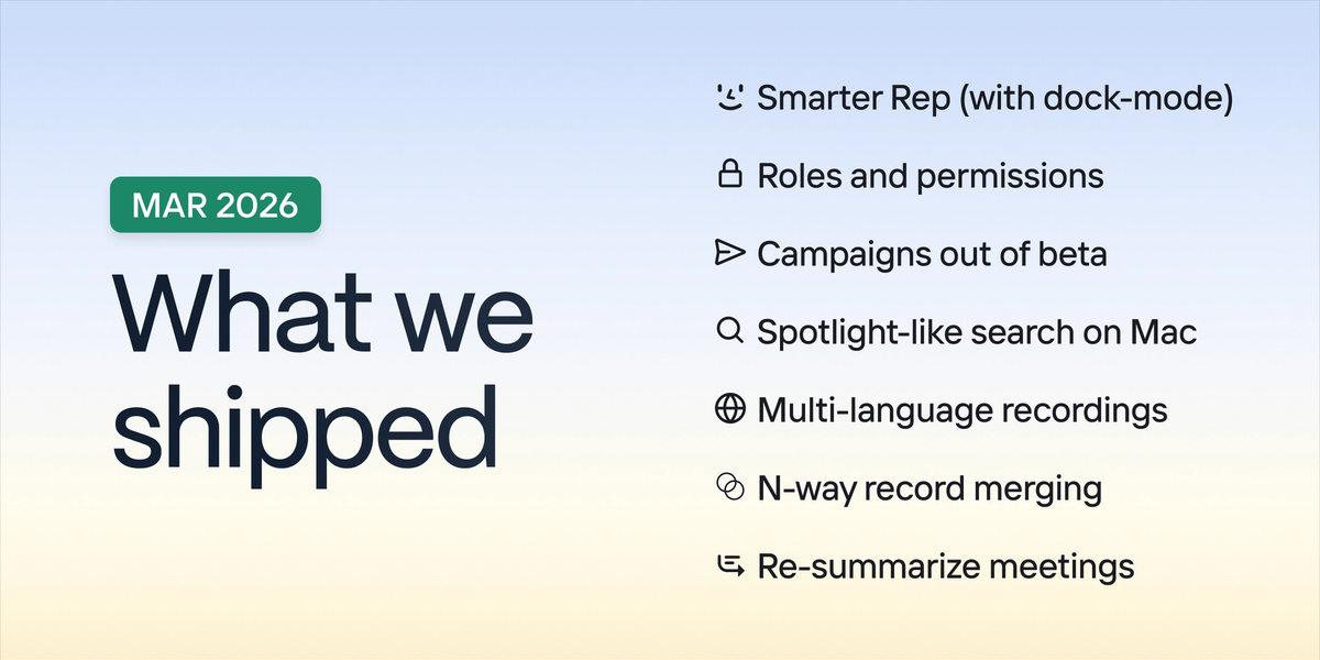
- New in Clarify: Mar 2026
- Campaigns: Outbound in a click

- Best Attio alternatives for 2026: Top CRMs compared
- Top 7 Folk CRM alternatives: Analyzing the reviews
- Sales tools for small businesses: choosing a tool that helps you scale
- CRM implementation: Steps, challenges, and best practices
- 10 best Pipedrive alternatives in 2026
- New in Clarify: Feb 2026
- Top 7 Apollo alternatives and competitors in 2026
- Product-led vs sales-led growth: identifying your sales motion
- How to think about finding product-market fit as a startup